


The Challenge
Originally known as AuthAir, the solution was secure authentication service (software and hardware) for healthcare providers. The device was about the size of a thumb drive and was worn or carried by the user as they moved from computer to computer through the day. The technology worked based on proximity; as the user approached the computer, they were logged in. When they moved away from the computer, they were logged out.
LogMeIn drew parallels between their own password manager (LastPass) and what AuthAir was doing. AuthAir was acquired in March of 2017 and the initiative of touchless authentication was folded into LastPass. An early, high-level goal was set in motion and the team began working on the tech. The goal was to no longer require users to carry a separate piece of hardware, instead to leverage something they already had– their phone.
The product was sent to the Innovation incubator to figure out how we could make touchless authentication fit into the existing password manager universe of LastPass.
The Research

We ran a workshop to narrow focus on the problem and decide on the scope of our MVP. We started by building out a persona and running interviews. From the interviews, we drew insights that helped us start to develop the existing technology into a solution that would work best for our target users.
In addition, we also demoed an updated prototype of the basic functionality to participants of the same demographics to validate that we were on the right track.

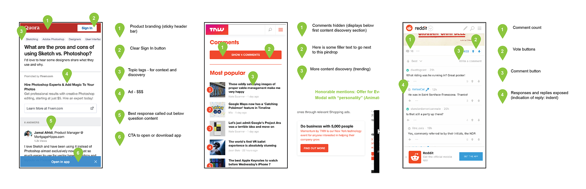
Mobile web users (general)
No true content discovery
Only possible ways to navigate to any other pages were hidden
The only clear CTAs were to Log In or Sign Up
Confusing navigation patterns
Native Facebook users (additional to mobile web issues)
Users hitting “back” on Facebook wrapper and being sent directly back into their FB experience
Very similar color schemes and page layouts (FB wrapper)
Visitors would comment on the FB post but would not comment within RallyPoint itself
From this data we came up with two hypotheses for the updated designs:
Users need easier ways to explore more content (exposing the value of RallyPoint)
We need to create paths to get users out of "Facebook browsing"
We then looked at the competitive landscape for some inspiration and insight into how they were handling similar experiences.
The Execution
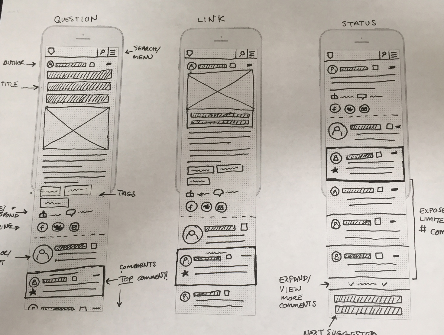
For the main body content we remained consistent with what currently existed but worked on improving the visual design and layout. For the new features, the overarching theme was to build a modular layout that we could easily swap in different sections and split test without things getting too murky. The final product was broken into three variations to test initially, a control, a discovery option, and a version with an email newsletter sign up.
The Designs

Check out the live product at rallypoint.com